Online Learning Doesn’t Have To Be Lonely
Redesigning Piazza to promote communication and discussion
Role:
Lead Product Designer
Club/Organization:
Product Space at UC San Diego
Skills:
User Experience Design
UX Research
Product Strategy
Competitive Analysis
Tools:
Figma
Adobe Creative Suite
Timeline:
6 weeks
Image: The current Piazza interface.
An Overview.
Piazza is a platform that allows for learning in a forum format. Students can ask questions to the entire class, and instructors can moderate the discussion and endorse answers.
Piazza’s strategy is to promote collaborative learning in an online environment.
Unfortunately, in many ways, Piazza is falling short. Let’s explore this idea further.
1. What’s the problem?
As college students, we as a team were highly aware of our peers’ distaste in Piazza’s user interface.
There’s a glaring problem with Piazza’s user interface.
But is there more that we can fix? Let’s explore this more through research.
1a. Piazza - defined.
pi·az·za
noun
a public square or marketplace
A “piazza” is a place for conversation, dialogue, and growth.
How can we update the platform Piazza to convey this defintion?
1b. Piazza’s current interface.
Let’s also take a look at Piazza’s current interface to see what stands out to us upon first glance.
Launch screen.
“Add new post” page.
Question page.
Upon first glance:
The current launch screen places the user straight into a class. Could we optimize this so that users can see all their courses at a glance?
There’s a lot of different font weights, sizes, colors, and elements all at once. Could we trim this down to be cleaner?
Let’s do some market and user research to see if we can back up our initial thoughts with statistics.
2. Market Research.
Prior to any user research or ideation, we needed to identify what the market for educational forum platforms looks like.
It was clear that while Piazza had many pros, other platforms like Edmodo and Remind were far more popular.
To understand why other platforms were doing so much better than Piazza, we ran a SWOT analysis - identifying the strengths, weaknesses, opportunities, and threats that are presented by Piazza.
3. User Research.
We began our user research by conducting user interviews, with individuals ranging from students to TA’s that have used Piazza before.
15
live interviews conducted
8
min; avg. interview length
Interesting results to note.
93% said that the interface was unorganized, unappealing, or confusing.
67% prefer smaller, more personal learning/studying environments.
Lack of organization
Not engaging
Outdated - better options out there
Overall sentiments:
Noteworthy quotes.
What are real students and TA’s saying?
“Just by looking at it, the website needs to look more appealing. It looks really outdated.”
- Business/Econ major @ UCSD, 19
“The layout stood out to me, and I am saying that in a bad way. I think maybe if it was less dull and messy I would be more inclined to use it.”
- Teaching Assistant @ UCSD, 19
“I get overwhelmed with all the piazza notifications, and it turns me off from opening it.”
- Computer Science major @ UCSD, 19
3a. The main pain points.
Image: Current piazza interface.
Confusing UI.
93% of participants expressed that the interface of Piazza was complicating their user experience.
Visual Clutter
Piazza’s interface has a multitude of different elements. Trimming that down can help decrease visual clutter.
Not Engaging.
40% of participants stated that they did not like opening Piazza because it didn’t help them in one way or another.
Let’s alleviate these pain points!
4. What’s the solution?
Completely redesign UI.
Removing unnecessary elements, cleaning up the layout, and removing distractions will allow for a more enjoyable user experience.
Implement a chatroom/channel feature.
Users expressed interest in having a more connected aspect to Piazza as a whole. Let’s make Piazza a stronger competitor on the market, all while helping unite students and instructors.
Image: Current piazza interface.
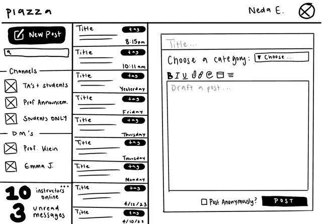
5. Wireframes.
And thus began the ideation stage! I started with some lofi wireframes to get started.
We already have some key differences!
All buttons are confined to left-hand navigation bar
Key statistics highlighed in bottom left corner
Overall cleaner UI
Wireframe feedback.
I ran our wireframes past my Product Manager (Justin) and my Product Marketer (Elisha), on top of doing my own personal review. Here’s what we had to say!
6. Final screens.
Click any screen to view in greater detail!
NEW: Dashboard
Easy, at-a-glance view of all courses.
Course Page Reimagined.
All navigation + buttons condensed to left-hand side bar.
Pages instead of an endless scroll.
Different tags have their own color, increasing scannability.
Filtered Posts Reimagined.
Instructor responses appear in another color.
NEW: Direct Messaging
Online status in upper right-hand corner.
Account Overview Reimagined.
Cleaner UI; straightforward notification preferences.
Filtering Posts Reimagined.
Dropdown filtering options.
NEW: Instructor + Students Channel
Instructor responses appear in another color.
Number of instructors online in upper right-hand corner.
NEW: View Student Profile
Connect with other students.
7. Live demo!
Rewind or fast-forward to view all our new features and the full redesign.
Thank you to my fellow fellows (LOL!), Elisha Chong and Justin Tan! We truly were the dream team while working on this project, and I’m so proud of all the work we accomplished. Additionally, our mentors Emily Jin and Nhathan Nguyen were integral in our success, so a huge thank you to them! I would also like to thank Product Space at UC San Diego and all of its members for the support. <3
Presenting our project!
The dream team!
Product Space at UC San Diego!


